

Switching Sides: How to Build a Cool Dark Mode Toggle with React and Tailwind


The dark mode is a popular feature that many websites and apps offer to their users. It allows them to switch between a light and a dark theme, depending on their preference or the ambient lighting. Dark mode can also help reduce eye strain, save battery life, and improve accessibility.
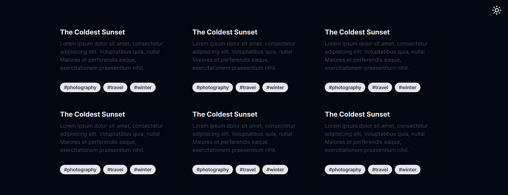
Dark mode enabled.
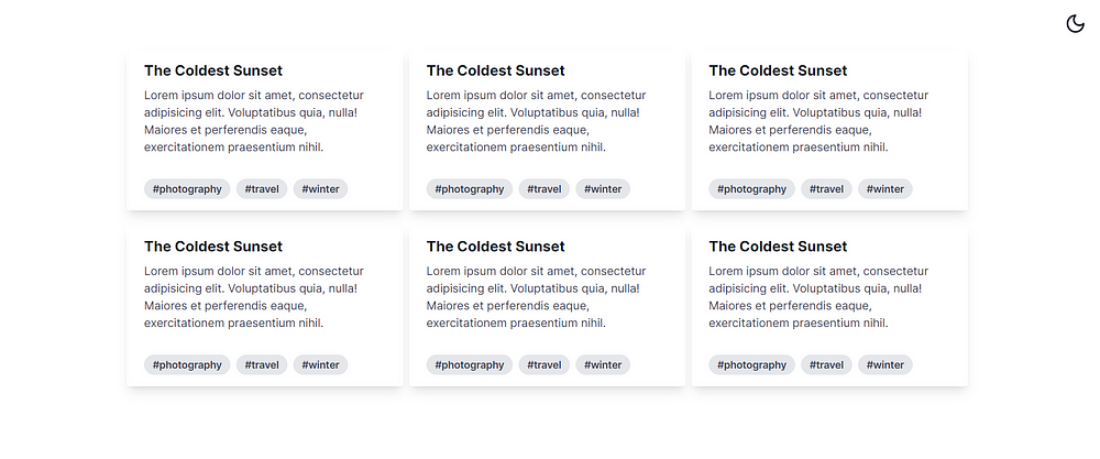
Light mode enabled.
In this blog post, I will show you how to create a simple dark mode toggle component in React using hooks, Tailwind CSS and the lucid-react library. Lucide-react is a collection of beautiful icons that are easy to use and customize. You can find more information about it here: Lucide | Lucide
Tailwind CSS is a utility-first CSS framework that lets you style your elements using classes. It is highly customizable and responsive, and it works well with React.
To use Tailwind CSS in our project, we need to install it as a dependency We also need to enable the darkMode option as class, which will allow us to toggle between dark and light themes using a class name. Here is what our tailwind.config.ts file looks like:
module.exports = {
  darkMode: ["class"], // enable dark mode as class
  // other options...
};
The Code
Let’s start by looking at the code for our dark mode toggle component. You can copy and paste it into your own project and move on or follow along with the explanation below.
import { useState, useEffect } from 'react';
import { Sun, Moon } from 'lucide-react';

export default function DarkmodeToggle() {
  const [currentTheme, setTheme] = useState(getInitialTheme());

  useEffect(() => {
    applyTheme();
  }, [currentTheme]);

  function getInitialTheme() {
    let userTheme = null;
    let systemTheme = true;
    if (typeof window !== 'undefined' && window.localStorage) {
      userTheme = localStorage.getItem('theme');
      systemTheme = window.matchMedia('(prefers-color-scheme: dark)').matches;
    }

    return userTheme || (systemTheme ? 'dark' : 'light');
  }

  function applyTheme() {
    if (currentTheme === 'dark') {
      document.documentElement.classList.add('dark');
      localStorage.setItem('theme', 'dark');
    } else {
      document.documentElement.classList.remove('dark');
      localStorage.setItem('theme', 'light');
    }
  }

  function toggleTheme() {
    setTheme(currentTheme === 'dark' ? 'light' : 'dark');
  }

  return (
    <>
      {currentTheme === 'dark' ? (
        <Sun width='30px' height='30px' onClick={toggleTheme} />
      ) : (
        <Moon width='30px' height='30px' onClick={toggleTheme} />
      )}
    </>
  );
}
Explanation
Now, let’s break down the code and see what each part does.
Importing the Dependencies
The first thing we do is import the useState and useEffect hooks from React, and the Sun and Moon icons from lucid-react. We will use these to create our component.
import { useState, useEffect } from 'react';
import { Sun, Moon } from 'lucide-react';
Creating the Component
Next, we define our component as a function called DarkmodeToggle. This component will have a state variable called currentTheme, which will store the current theme of the app. We will use the useState hook to initialize this variable with a function called getInitialTheme, which we will define later.
export default function DarkmodeToggle() {
  const [currentTheme, setTheme] = useState(getInitialTheme());
We also use the useEffect hook to run a function called applyTheme every time the currentTheme variable changes. This function will update the document’s class list and the local storage with the current theme.
useEffect(() => {
    applyTheme();
  }, [currentTheme]);
Getting the Initial Theme
The getInitialTheme function is responsible for determining the initial theme of the app based on two factors: the user’s preference and the system’s preference. We use the window.localStorage object to check if the user has previously set a theme in our app. If so, we return that theme. Otherwise, we use the window.matchMedia method to check if the system prefers a dark or a light theme. If so, we return that theme. If none of these conditions are met, we default to a light theme.
function getInitialTheme() {
    let userTheme = null;
    let systemTheme = true;
    if (typeof window !== 'undefined' && window.localStorage) {
      userTheme = localStorage.getItem('theme');
      systemTheme = window.matchMedia('(prefers-color-scheme: dark)').matches;
    }

    return userTheme || (systemTheme ? 'dark' : 'light');
  }
Applying the Theme
The applyTheme function is responsible for applying the current theme to the document and saving it to the local storage. We use the document.documentElement.classList object to add or remove a class called dark depending on the current theme. This class will be used to style our app accordingly in CSS. We also use the localStorage.setItem method to store the current theme in the local storage, so that it persists across sessions.
function applyTheme() {
    if (currentTheme === 'dark') {
      document.documentElement.classList.add('dark');
      localStorage.setItem('theme', 'dark');
    } else {
      document.documentElement.classList.remove('dark');
      localStorage.setItem('theme', 'light');
    }
  }
Toggling the Theme
The toggleTheme function is responsible for toggling the current theme between dark and light. We use the setTheme function to update the currentTheme variable with the opposite value of what it currently is.
function toggleTheme() {
    setTheme(currentTheme === 'dark' ? 'light' : 'dark');
  }
Rendering the Component
Finally, we render our component using JSX. We use a conditional rendering to display either the Sun or the Moon icon depending on the current theme. We also pass a width, a height, and an onClick prop to each icon. The onClick prop will trigger the toggleTheme function when the user clicks on the icon
return (
    <>
      {currentTheme === 'dark' ? (
        <Sun width='30px' height='30px' onClick={toggleTheme} />
      ) : (
        <Moon width='30px' height='30px' onClick={toggleTheme} />
      )}
    </>
  );
The Result
That’s it 🫰! We have created a simple and elegant dark mode toggle component in React using hooks.
Dark Mode Toggle Demo - YouTube